---
id: custom-theme
title: 005 - Customize your App's theme
description: Documentation on customizing the look and feel of your Backstage app.
---
::::info
This documentation is written for the new frontend system, which is the default
in new Backstage apps. If your Backstage app still uses the old frontend system,
read the [old frontend system version of this guide](./customize-theme--old.md)
instead.
::::
Backstage ships with a default theme with a light and dark mode variant. The themes are provided as a part of the [`@backstage/theme`](https://www.npmjs.com/package/@backstage/theme) package, which also includes utilities for customizing the default theme, or creating completely new themes.
## Creating a Custom Theme
The easiest way to create a new theme is to use the `createUnifiedTheme` function exported by the [`@backstage/theme`](https://www.npmjs.com/package/@backstage/theme) package. You can use it to override some basic parameters of the default theme such as the color palette and font.
For example, you can create a new theme based on the default light theme like this:
```ts title="packages/app/src/theme/myTheme.ts"
import {
createBaseThemeOptions,
createUnifiedTheme,
palettes,
} from '@backstage/theme';
export const myTheme = createUnifiedTheme({
...createBaseThemeOptions({
palette: palettes.light,
}),
fontFamily: 'Comic Sans MS',
defaultPageTheme: 'home',
});
```
:::note Note
We recommend creating a `theme` folder in `packages/app/src` to place your theme file to keep things nicely organized.
:::
You can also create a theme from scratch that matches the `BackstageTheme` type exported by [`@backstage/theme`](https://www.npmjs.com/package/@backstage/theme). See the
[Material UI docs on theming](https://material-ui.com/customization/theming/) for more information about how that can be done.
## Using your Custom Theme
In the new frontend system, themes are installed as extensions using `ThemeBlueprint` from `@backstage/plugin-app-react`. The theme extension is then bundled into a frontend module and passed to `createApp`.
First, install the required packages:
```bash title="From your Backstage root directory"
yarn --cwd packages/app add @backstage/frontend-plugin-api @backstage/plugin-app-react
```
Then create the theme extension and install it in your app:
```tsx title="packages/app/src/App.tsx"
import { createApp } from '@backstage/frontend-defaults';
import { createFrontendModule } from '@backstage/frontend-plugin-api';
import { ThemeBlueprint } from '@backstage/plugin-app-react';
import { UnifiedThemeProvider } from '@backstage/theme';
import LightIcon from '@material-ui/icons/WbSunny';
import { myTheme } from './theme/myTheme';
const myThemeExtension = ThemeBlueprint.make({
name: 'my-theme',
params: {
theme: {
id: 'my-theme',
title: 'My Custom Theme',
variant: 'light',
icon: ,
Provider: ({ children }) => (
),
},
},
});
const app = createApp({
features: [
createFrontendModule({
pluginId: 'app',
extensions: [myThemeExtension],
}),
],
});
export default app.createRoot();
```
Your custom theme extension will be added alongside the built-in light and dark themes. If you want your custom theme to _replace_ the default themes, you can disable them in `app-config.yaml`:
```yaml title="app-config.yaml"
app:
extensions:
- theme:app/light: false
- theme:app/dark: false
```
## Example of a custom theme
```ts title="packages/app/src/theme/myTheme.ts"
import {
createBaseThemeOptions,
createUnifiedTheme,
genPageTheme,
palettes,
shapes,
} from '@backstage/theme';
export const myTheme = createUnifiedTheme({
...createBaseThemeOptions({
palette: {
...palettes.light,
primary: {
main: '#343b58',
},
secondary: {
main: '#565a6e',
},
error: {
main: '#8c4351',
},
warning: {
main: '#8f5e15',
},
info: {
main: '#34548a',
},
success: {
main: '#485e30',
},
background: {
default: '#d5d6db',
paper: '#d5d6db',
},
banner: {
info: '#34548a',
error: '#8c4351',
text: '#343b58',
link: '#565a6e',
},
errorBackground: '#8c4351',
warningBackground: '#8f5e15',
infoBackground: '#343b58',
navigation: {
background: '#343b58',
indicator: '#8f5e15',
color: '#d5d6db',
selectedColor: '#ffffff',
},
},
}),
defaultPageTheme: 'home',
fontFamily: 'Comic Sans MS',
/* below drives the header colors */
pageTheme: {
home: genPageTheme({ colors: ['#8c4351', '#343b58'], shape: shapes.wave }),
documentation: genPageTheme({
colors: ['#8c4351', '#343b58'],
shape: shapes.wave2,
}),
tool: genPageTheme({ colors: ['#8c4351', '#343b58'], shape: shapes.round }),
service: genPageTheme({
colors: ['#8c4351', '#343b58'],
shape: shapes.wave,
}),
website: genPageTheme({
colors: ['#8c4351', '#343b58'],
shape: shapes.wave,
}),
library: genPageTheme({
colors: ['#8c4351', '#343b58'],
shape: shapes.wave,
}),
other: genPageTheme({ colors: ['#8c4351', '#343b58'], shape: shapes.wave }),
app: genPageTheme({ colors: ['#8c4351', '#343b58'], shape: shapes.wave }),
apis: genPageTheme({ colors: ['#8c4351', '#343b58'], shape: shapes.wave }),
},
});
```
For a more complete example of a custom theme including Backstage and Material UI component overrides, see the [Aperture theme](https://github.com/backstage/demo/blob/master/packages/app/src/theme/aperture.ts) from the [Backstage demo site](https://demo.backstage.io).
## Custom Typography
When creating a custom theme you can also customize various aspects of the default typography, here's an example using simplified theme:
```ts title="packages/app/src/theme/myTheme.ts"
import {
createBaseThemeOptions,
createUnifiedTheme,
palettes,
} from '@backstage/theme';
export const myTheme = createUnifiedTheme({
...createBaseThemeOptions({
palette: palettes.light,
typography: {
htmlFontSize: 16,
fontFamily: 'Arial, sans-serif',
h1: {
fontSize: 54,
fontWeight: 700,
marginBottom: 10,
},
h2: {
fontSize: 40,
fontWeight: 700,
marginBottom: 8,
},
h3: {
fontSize: 32,
fontWeight: 700,
marginBottom: 6,
},
h4: {
fontWeight: 700,
fontSize: 28,
marginBottom: 6,
},
h5: {
fontWeight: 700,
fontSize: 24,
marginBottom: 4,
},
h6: {
fontWeight: 700,
fontSize: 20,
marginBottom: 2,
},
},
defaultPageTheme: 'home',
}),
});
```
If you wanted to only override a sub-set of the typography setting, for example just `h1` then you would do this:
```ts title="packages/app/src/theme/myTheme.ts"
import {
createBaseThemeOptions,
createUnifiedTheme,
defaultTypography,
palettes,
} from '@backstage/theme';
export const myTheme = createUnifiedTheme({
...createBaseThemeOptions({
palette: palettes.light,
typography: {
...defaultTypography,
htmlFontSize: 16,
fontFamily: 'Roboto, sans-serif',
h1: {
fontSize: 72,
fontWeight: 700,
marginBottom: 10,
},
},
defaultPageTheme: 'home',
}),
});
```
## Custom Fonts
To add custom fonts, you first need to store the font so that it can be imported. We suggest creating the `assets/fonts` directory in your front-end application `src` folder.
You can then declare the font style following the `@font-face` syntax from [Material UI Typography](https://mui.com/material-ui/customization/typography/).
After that you can then utilize the `styleOverrides` of `MuiCssBaseline` under components to add a font to the `@font-face` array.
```ts title="packages/app/src/theme/myTheme.ts"
import MyCustomFont from '../assets/fonts/My-Custom-Font.woff2';
const myCustomFont = {
fontFamily: 'My-Custom-Font',
fontStyle: 'normal',
fontDisplay: 'swap',
fontWeight: 300,
src: `
local('My-Custom-Font'),
url(${MyCustomFont}) format('woff2'),
`,
};
export const myTheme = createUnifiedTheme({
fontFamily: 'My-Custom-Font',
palette: palettes.light,
components: {
MuiCssBaseline: {
styleOverrides: {
'@font-face': [myCustomFont],
},
},
},
});
```
If you want to utilize different or multiple fonts, then you can set the top level `fontFamily` to what you want for your body, and then override `fontFamily` in `typography` to control fonts for various headings.
```ts title="packages/app/src/theme/myTheme.ts"
import MyCustomFont from '../assets/fonts/My-Custom-Font.woff2';
import myAwesomeFont from '../assets/fonts/My-Awesome-Font.woff2';
const myCustomFont = {
fontFamily: 'My-Custom-Font',
fontStyle: 'normal',
fontDisplay: 'swap',
fontWeight: 300,
src: `
local('My-Custom-Font'),
url(${MyCustomFont}) format('woff2'),
`,
};
const myAwesomeFont = {
fontFamily: 'My-Awesome-Font',
fontStyle: 'normal',
fontDisplay: 'swap',
fontWeight: 300,
src: `
local('My-Awesome-Font'),
url(${myAwesomeFont}) format('woff2'),
`,
};
export const myTheme = createUnifiedTheme({
fontFamily: 'My-Custom-Font',
components: {
MuiCssBaseline: {
styleOverrides: {
'@font-face': [myCustomFont, myAwesomeFont],
},
},
},
...createBaseThemeOptions({
palette: palettes.light,
typography: {
...defaultTypography,
htmlFontSize: 16,
fontFamily: 'My-Custom-Font',
h1: {
fontSize: 72,
fontWeight: 700,
marginBottom: 10,
fontFamily: 'My-Awesome-Font',
},
},
defaultPageTheme: 'home',
}),
});
```
## Overriding Backstage and Material UI components styles
When creating a custom theme you would be applying different values to component's CSS rules that use the theme object. For example, a Backstage component's styles might look like this:
```tsx
const useStyles = makeStyles(
theme => ({
header: {
padding: theme.spacing(3),
boxShadow: '0 0 8px 3px rgba(20, 20, 20, 0.3)',
backgroundImage: theme.page.backgroundImage,
},
}),
{ name: 'BackstageHeader' },
);
```
Notice how the `padding` is getting its value from `theme.spacing`, that means that setting a value for spacing in your custom theme would affect this component padding property and the same goes for `backgroundImage` which uses `theme.page.backgroundImage`. However, the `boxShadow` property doesn't reference any value from the theme, that means that creating a custom theme wouldn't be enough to alter the `box-shadow` property or to add css rules that aren't already defined like a margin. For these cases you should also create an override.
Here's how you would do that:
```ts title="packages/app/src/theme/myTheme.ts"
import {
createBaseThemeOptions,
createUnifiedTheme,
palettes,
} from '@backstage/theme';
export const myTheme = createUnifiedTheme({
...createBaseThemeOptions({
palette: palettes.light,
}),
fontFamily: 'Comic Sans MS',
defaultPageTheme: 'home',
components: {
BackstageHeader: {
styleOverrides: {
header: ({ theme }) => ({
width: 'auto',
margin: '20px',
boxShadow: 'none',
borderBottom: `4px solid ${theme.palette.primary.main}`,
}),
},
},
},
});
```
## Custom Logo
In addition to a custom theme, you can also customize the logo displayed at the far top left of the site.
In your frontend app, locate `src/components/Root/` folder. You'll find two components:
- `LogoFull.tsx` - A larger logo used when the Sidebar navigation is opened.
- `LogoIcon.tsx` - A smaller logo used when the Sidebar navigation is closed.
To replace the images, you can simply replace the relevant code in those components with raw SVG definitions.
You can also use another web image format such as PNG by importing it. To do this, place your new image into a new subdirectory such as `src/components/Root/logo/my-company-logo.png`, and then add this code:
```tsx
import MyCustomLogoFull from './logo/my-company-logo.png';
const LogoFull = () => {
return  ;
};
```
## Icons
So far you've seen how to create your own theme and add your own logo. In the following sections you'll be shown how to override the existing icons and how to add more icons.
### Custom Icons
You can customize the app's default icons using `IconBundleBlueprint` from `@backstage/plugin-app-react`. This creates an extension that overrides built-in icons.
```tsx title="packages/app/src/App.tsx"
import { createApp } from '@backstage/frontend-defaults';
import { createFrontendModule } from '@backstage/frontend-plugin-api';
import { IconBundleBlueprint } from '@backstage/plugin-app-react';
import { ExampleIcon } from './assets/customIcons';
const customIconBundle = IconBundleBlueprint.make({
name: 'custom-icons',
params: {
icons: {
github: ExampleIcon,
},
},
});
const app = createApp({
features: [
createFrontendModule({
pluginId: 'app',
extensions: [customIconBundle],
}),
],
});
export default app.createRoot();
```
### Adding Icons
You can register additional icons so that they can be used in other places like entity links. For example, to add an `alert` icon:
```tsx title="packages/app/src/App.tsx"
import { createApp } from '@backstage/frontend-defaults';
import { createFrontendModule } from '@backstage/frontend-plugin-api';
import AlarmIcon from '@material-ui/icons/Alarm';
import { IconBundleBlueprint } from '@backstage/plugin-app-react';
const extraIcons = IconBundleBlueprint.make({
name: 'extra-icons',
params: {
icons: {
alert: AlarmIcon,
},
},
});
const app = createApp({
features: [
createFrontendModule({
pluginId: 'app',
extensions: [extraIcons],
}),
],
});
export default app.createRoot();
```
You can then reference `alert` for your icon in entity links like this:
```yaml
apiVersion: backstage.io/v1alpha1
kind: Component
metadata:
name: artist-lookup
description: Artist Lookup
links:
- url: https://example.com/alert
title: Alerts
icon: alert
```
And this is the result:
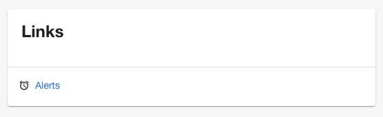
Another way you can use these icons is from the `AppContext` like this:
```ts
import { useApp } from '@backstage/core-plugin-api';
const app = useApp();
const alertIcon = app.getSystemIcon('alert');
```
You might want to use this method if you have an icon you want to use in several locations.
:::note Note
If the icon is not available as one of the default icons or one you've added then it will fall back to Material UI's `LanguageIcon`
:::
## Custom Sidebar
In the new frontend system, the sidebar is managed by the built-in `app/nav` extension. You can customize it by creating a `NavContentBlueprint` extension. See the [sidebar customization](../../frontend-system/building-apps/08-migrating.md#app-root-sidebar) documentation for detailed instructions on creating a custom sidebar layout with sub-menus and custom grouping.
## Custom Homepage
In addition to a custom theme, a custom logo, you can also customize the
homepage of your app. Read the full guide on the [next page](../../getting-started/homepage.md).
## Migrating to Material UI v5
We now support Material UI v5 in Backstage. Check out our [migration guide](../../tutorials/migrate-to-mui5.md) to get started.
;
};
```
## Icons
So far you've seen how to create your own theme and add your own logo. In the following sections you'll be shown how to override the existing icons and how to add more icons.
### Custom Icons
You can customize the app's default icons using `IconBundleBlueprint` from `@backstage/plugin-app-react`. This creates an extension that overrides built-in icons.
```tsx title="packages/app/src/App.tsx"
import { createApp } from '@backstage/frontend-defaults';
import { createFrontendModule } from '@backstage/frontend-plugin-api';
import { IconBundleBlueprint } from '@backstage/plugin-app-react';
import { ExampleIcon } from './assets/customIcons';
const customIconBundle = IconBundleBlueprint.make({
name: 'custom-icons',
params: {
icons: {
github: ExampleIcon,
},
},
});
const app = createApp({
features: [
createFrontendModule({
pluginId: 'app',
extensions: [customIconBundle],
}),
],
});
export default app.createRoot();
```
### Adding Icons
You can register additional icons so that they can be used in other places like entity links. For example, to add an `alert` icon:
```tsx title="packages/app/src/App.tsx"
import { createApp } from '@backstage/frontend-defaults';
import { createFrontendModule } from '@backstage/frontend-plugin-api';
import AlarmIcon from '@material-ui/icons/Alarm';
import { IconBundleBlueprint } from '@backstage/plugin-app-react';
const extraIcons = IconBundleBlueprint.make({
name: 'extra-icons',
params: {
icons: {
alert: AlarmIcon,
},
},
});
const app = createApp({
features: [
createFrontendModule({
pluginId: 'app',
extensions: [extraIcons],
}),
],
});
export default app.createRoot();
```
You can then reference `alert` for your icon in entity links like this:
```yaml
apiVersion: backstage.io/v1alpha1
kind: Component
metadata:
name: artist-lookup
description: Artist Lookup
links:
- url: https://example.com/alert
title: Alerts
icon: alert
```
And this is the result:

Another way you can use these icons is from the `AppContext` like this:
```ts
import { useApp } from '@backstage/core-plugin-api';
const app = useApp();
const alertIcon = app.getSystemIcon('alert');
```
You might want to use this method if you have an icon you want to use in several locations.
:::note Note
If the icon is not available as one of the default icons or one you've added then it will fall back to Material UI's `LanguageIcon`
:::
## Custom Sidebar
In the new frontend system, the sidebar is managed by the built-in `app/nav` extension. You can customize it by creating a `NavContentBlueprint` extension. See the [sidebar customization](../../frontend-system/building-apps/08-migrating.md#app-root-sidebar) documentation for detailed instructions on creating a custom sidebar layout with sub-menus and custom grouping.
## Custom Homepage
In addition to a custom theme, a custom logo, you can also customize the
homepage of your app. Read the full guide on the [next page](../../getting-started/homepage.md).
## Migrating to Material UI v5
We now support Material UI v5 in Backstage. Check out our [migration guide](../../tutorials/migrate-to-mui5.md) to get started.