---
id: icons
title: Customizing Icons
sidebar_label: Icons
description: Learn how to customize and add icons to your Backstage app.
---
::::info
This documentation is written for the new frontend system, which is the default
in new Backstage apps. If your Backstage app still uses the old frontend system,
read the [old frontend system version of this guide](./icons--old.md) instead.
::::
Backstage comes with a set of [default icons](https://github.com/backstage/backstage/blob/master/packages/app-defaults/src/defaults/icons.tsx) used throughout the app, for example in the sidebar, entity links, and catalog kind badges. You can override any of these icons or register additional ones to match your organization's visual identity.
## Custom icons
To override a default icon, create an icon bundle extension using
`IconBundleBlueprint` from `@backstage/plugin-app-react`. Each entry in the
`icons` object maps an icon key to a React component or JSX element that
replaces the built-in icon with the same key.
### Requirements
- Files in `.svg` format or any image format that can be rendered as a React
component.
- React components created for the icons, or `IconElement` JSX elements.
### Create a React component
In your frontend application, locate the `src` folder. Create an
`assets/icons` directory and a `customIcons.tsx` file:
```tsx title="packages/app/src/assets/icons/customIcons.tsx"
import { SvgIcon, SvgIconProps } from '@material-ui/core';
export const ExampleIcon = (props: SvgIconProps) => (
);
```
### Use the custom icon
Supply your custom icon in `packages/app/src/App.tsx` by creating an icon
bundle extension and installing it as a module for the `app` plugin:
```tsx title="packages/app/src/App.tsx"
import { createApp } from '@backstage/frontend-defaults';
import { createFrontendModule } from '@backstage/frontend-plugin-api';
import { IconBundleBlueprint } from '@backstage/plugin-app-react';
import { ExampleIcon } from './assets/icons/customIcons';
const customIconBundle = IconBundleBlueprint.make({
name: 'custom-icons',
params: {
icons: {
github: ,
},
},
});
const app = createApp({
features: [
createFrontendModule({
pluginId: 'app',
extensions: [customIconBundle],
}),
],
});
export default app.createRoot();
```
The `icons` object maps icon keys to React components or JSX elements. In this
example, the built-in `github` icon is replaced with `ExampleIcon`. You can
override multiple icons at once by adding more entries to the object.
The module can also be declared in a separate module package if you prefer to
keep icon customizations separate from your app setup.
## Adding icons
If the [default icons](https://github.com/backstage/backstage/blob/master/packages/app-defaults/src/defaults/icons.tsx) do not cover your needs, you can register additional icons so that they
can be referenced in places like entity links. For this example we use the
`RiAlarmLine` icon from [Remix Icon](https://remixicon.com/), declared as a JSX
element:
```tsx title="packages/app/src/App.tsx"
import { createApp } from '@backstage/frontend-defaults';
import { createFrontendModule } from '@backstage/frontend-plugin-api';
import { RiAlarmLine } from '@remixicon/react';
import { IconBundleBlueprint } from '@backstage/plugin-app-react';
const extraIcons = IconBundleBlueprint.make({
name: 'extra-icons',
params: {
icons: {
alert: ,
},
},
});
const app = createApp({
features: [
createFrontendModule({
pluginId: 'app',
extensions: [extraIcons],
}),
],
});
export default app.createRoot();
```
You can then reference `alert` as the icon in entity links:
```yaml
apiVersion: backstage.io/v1alpha1
kind: Component
metadata:
name: artist-lookup
description: Artist Lookup
links:
- url: https://example.com/alert
title: Alerts
icon: alert
```
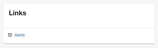
And this is the result:
### Using icons in plugin code
To look up a registered icon at runtime, use the `IconsApi`:
```ts
import { useApi, iconsApiRef } from '@backstage/frontend-plugin-api';
const iconsApi = useApi(iconsApiRef);
const alertIcon = iconsApi.icon('alert');
```
This is useful when you have an icon that you want to render in several
locations within a plugin.
:::note
If an icon key is not available as a default icon or one you have added, a
fallback icon is used instead.
:::